Formerly known as Slice, Rakuten Intelligence provides millions of their users with trusted online retail data and insights, so they might better understand their e-commerce landscape. The client approached us to reimagine their website to boost their own brand, while also unveiling a few new key products.
In the website’s previous life, it lacked a meaningful content strategy. To remedy this, we mapped out a new information hierarchy to offer clearer product groupings, allowing users to get the information they need.
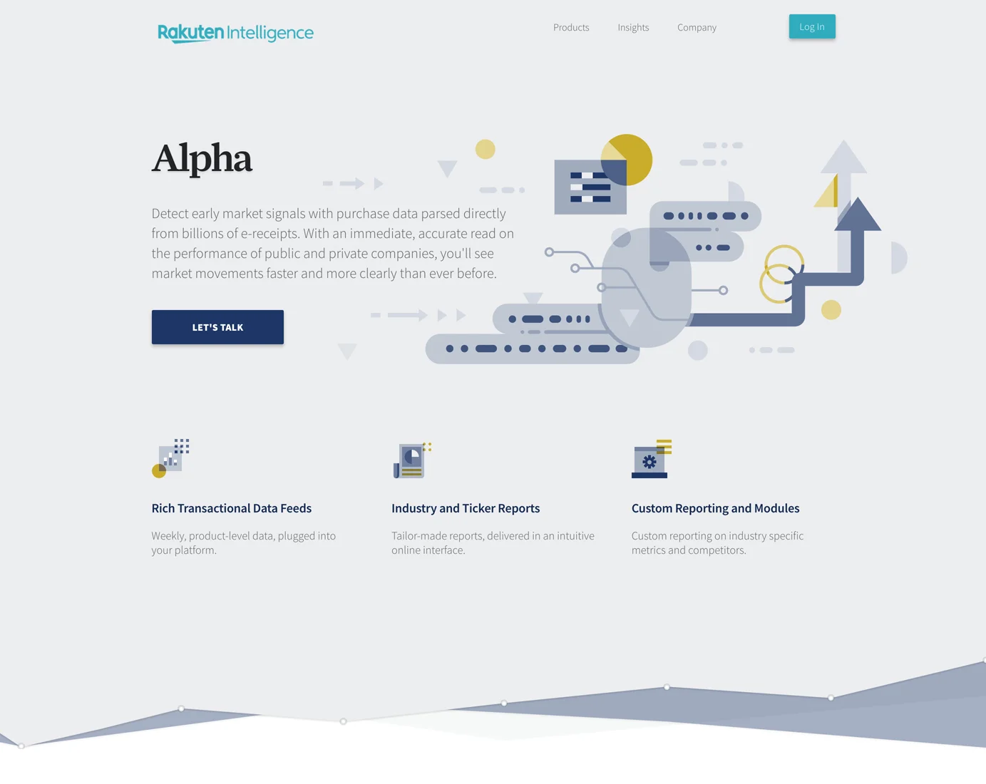
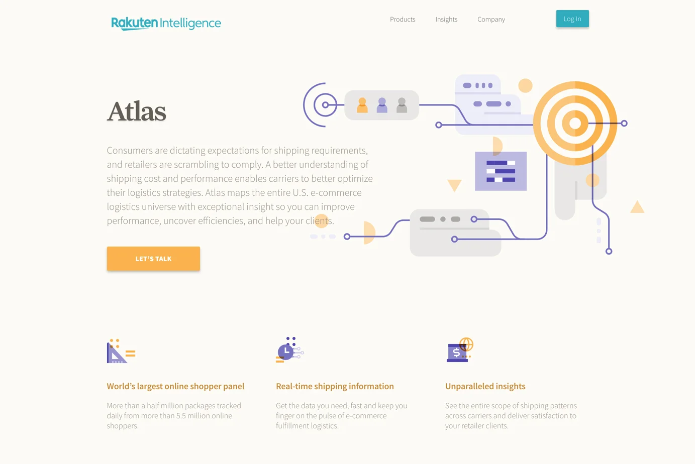
From a visual standpoint, we moved Rakuten beyond stock photography and into a more ownable look and feel. Their newly introduced suite of products inspired us to create a system of abstract illustrations that would give each product page their own “identity”, while still connecting to a larger visual whole.
To do this we sought to bring in a dedicated illustrator to create this world—someone that had a history of working with big brands and could bring a unique vision. We were extremely happy to bring in renowned designer Ryan Putnam, who provided some great work for Dropbox, Stripe and many personal and inspiring illustration projects.
The website really came to life through these illustrations, with the homepage setting the tone for the style and shapes customers would see across the subsequent products. Each page feels like they have their own identity with unique color washes, but never disconnected from the big picture. The iconography is abstract and clever, while not distracting from the information.
Another really important piece of this project, however, was creating a design system for the various charts that showcase Rakuten's insights. These live on the company blog and get shared out to third party sites, so they needed to have a higher standard in execution.
At the project’s end, we delivered a truly ownable vision and design system for Rakuten Intelligence. Even after Parade’s involvement, new pages have popped up while building on the world we helped create for them.


